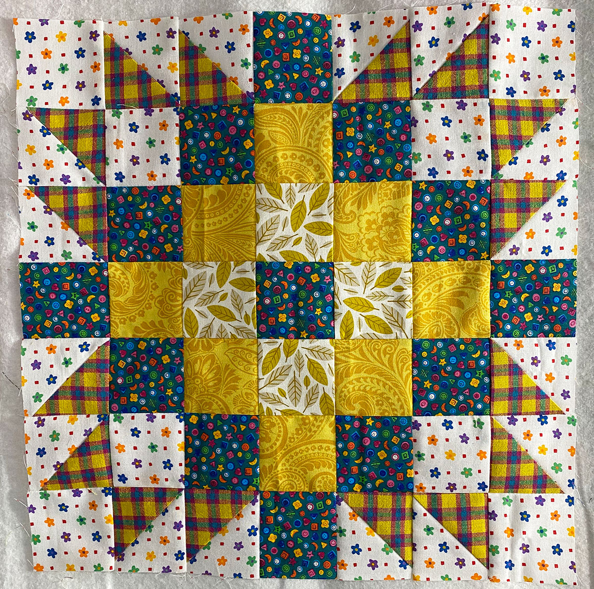
This one threatened to overcome me. I started going one direction, all yellows, but the background I had chosen just didn’t mesh with those.
So I replaced the darkest golden yellow with the blue/multicolor, which worked much better. And I replaced the medium and lightest yellows with some brighter ones (yes, brighter!). But when I put the fabrics on the design wall, they just seared the eyes.
So I pulled back out the two yellows I had originally chosen for medium and light and decided that they actually worked best after all.

