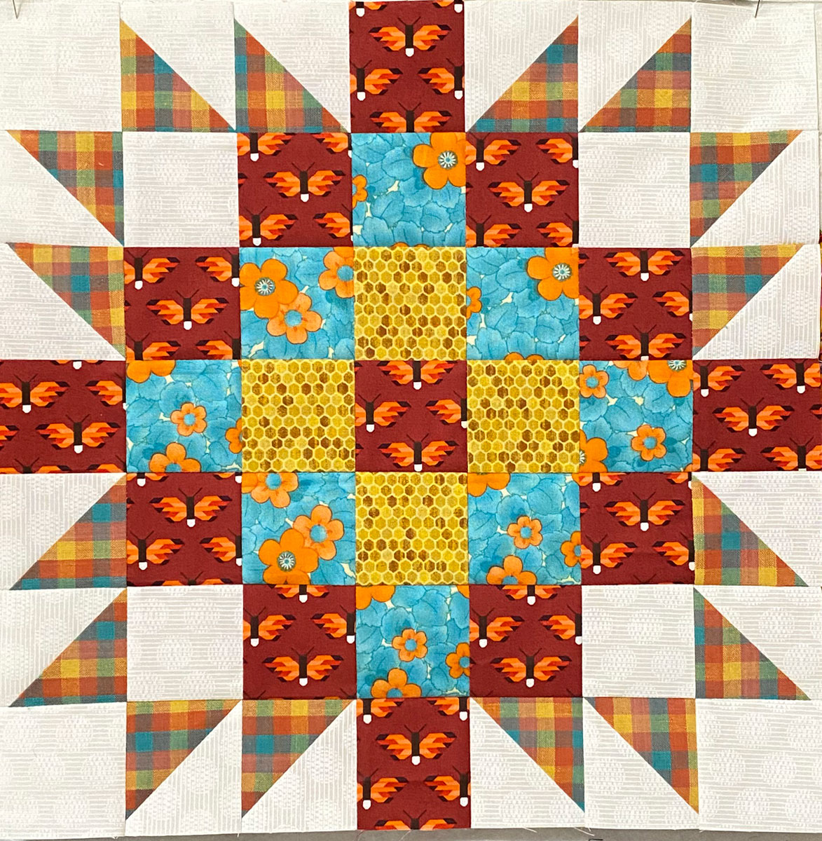
I picked up this brighter, chunkier plaid (check?) and had a time picking fabrics to go with it. I started with the aqua print with orange flowers, which is probably the reason I had such a time finding additional coordinating fabrics. Once again, I wanted to find something that would go with all of the colors in the plaid.
When I finally pulled the butterflies, I knew I was on to something. Yes, the background is darker than any of the colors in the plaid, but the orange in it plays perfectly with that plaid and the the floral print. The yellow was the last fabric I pulled. I was getting really frustrated because it couldn’t be too bright, but also couldn’t be too light or too dull. I do like how the theme of flowers and butterflies and honeycomb kind of go together – and it feels like a very summery block.