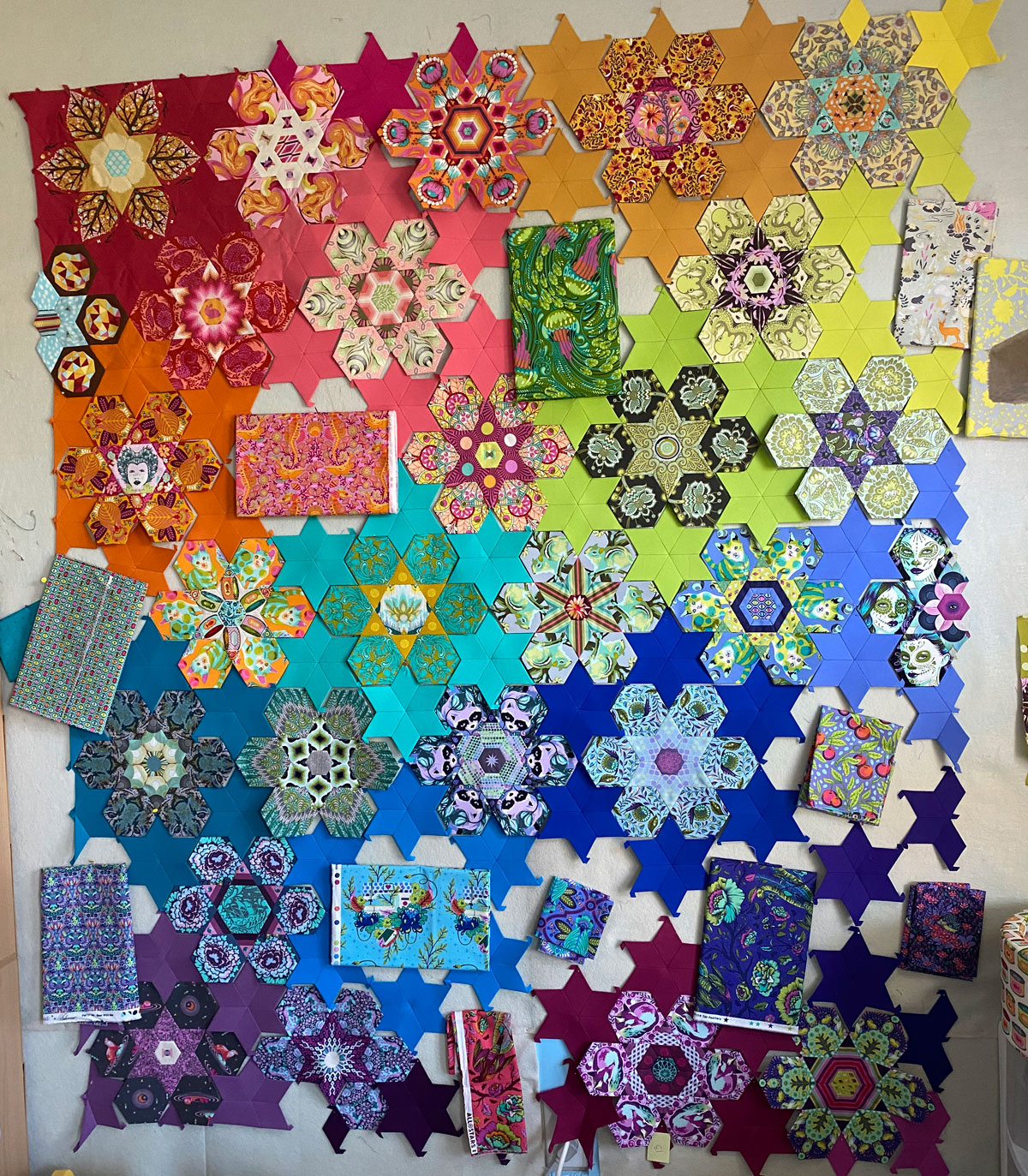
So I spent some time going through my stash and trying to figure out which prints I want to use as the primary bloom hexagons. I will still have to figure out the coordinating prints (and how I want to design each bloom), but this is what I have in mind.
This will be a photo-heavy post. Each caption will include the collection, print name, and colorway name, in that order.
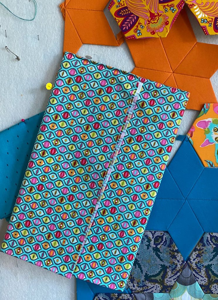
This is a transition piece for sure. I don’t plan on fussy-cutting to get the three blooms to match.
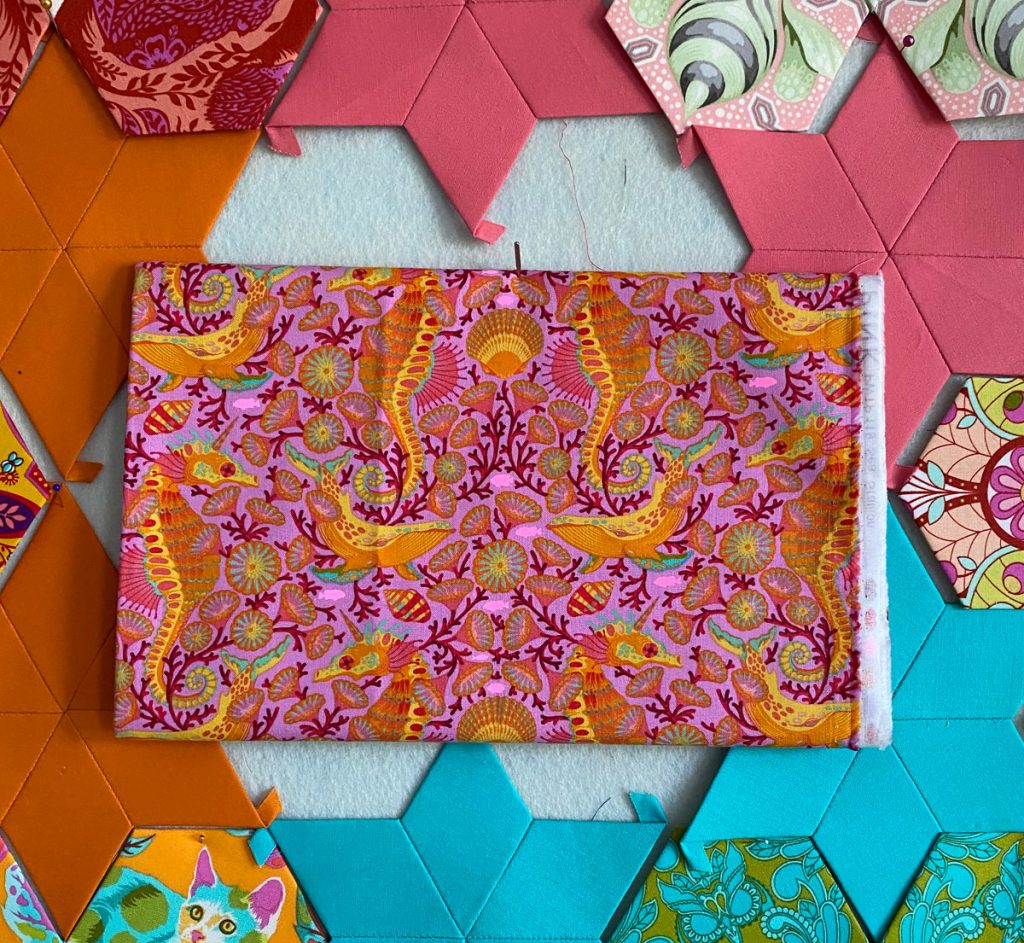
I think for this one I’ll plan on focusing on the seahorse. Not sure if I’ll want them to all face the same direction or not.
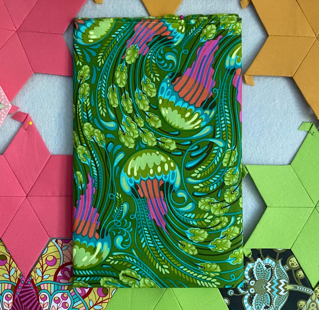
I definitely want to try to capture as much of the jellyfish with the green, orange, and pink.
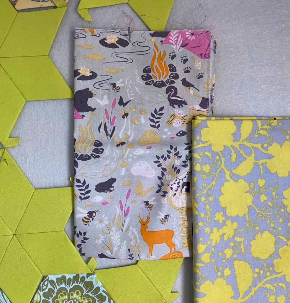
I first pulled the True Colors print, but as I was searching through my older fabrics, I spied the silver Moon Shine print, and thought it might actually go here. I’m undecided at the moment. I might use them both somehow.
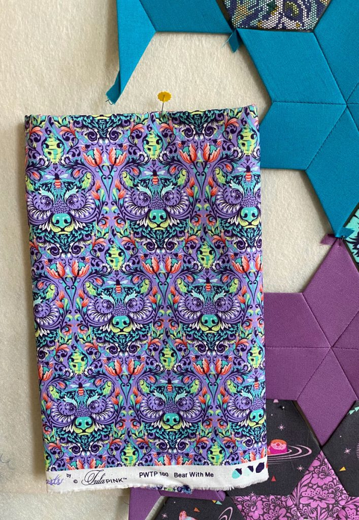
Obviously, the bear’s face will be front and center for this one.
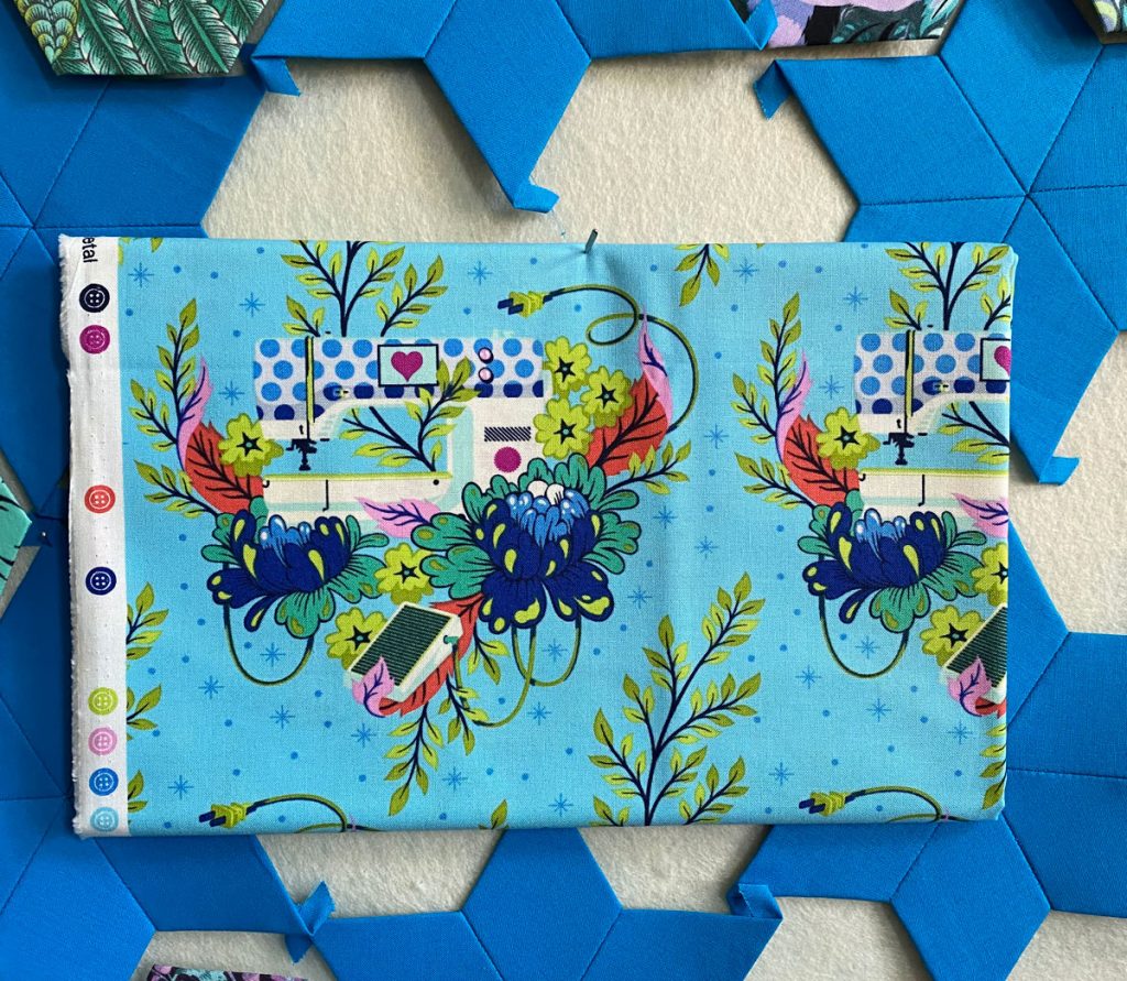
I think the machine is too big to get into the frame for the hexagon, so I’ll probably focus on the flower(s). I might focus on the dots in the machine though.
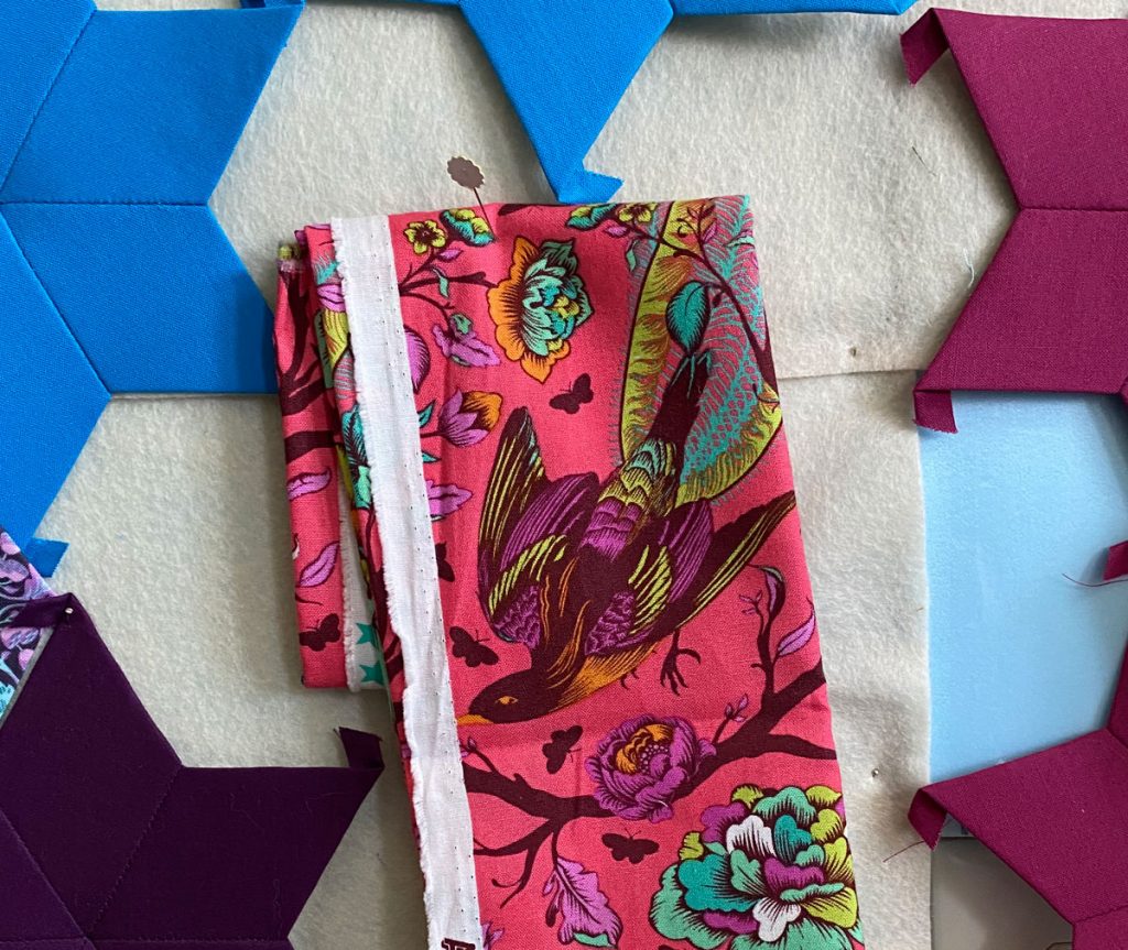
The bird absolutely must be the focus of this bloom.
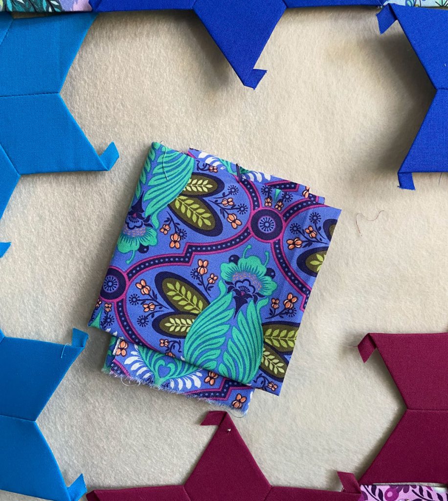
I’ve already focused on the bee in another bloom. I really want to make sure to get that wine-pink in focus.
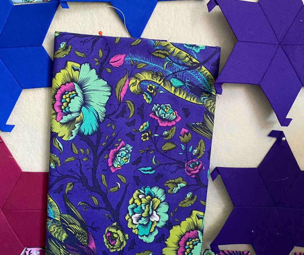
This time, I want to focus on some of the smaller flowers, to get that rich background along with the bright pink.
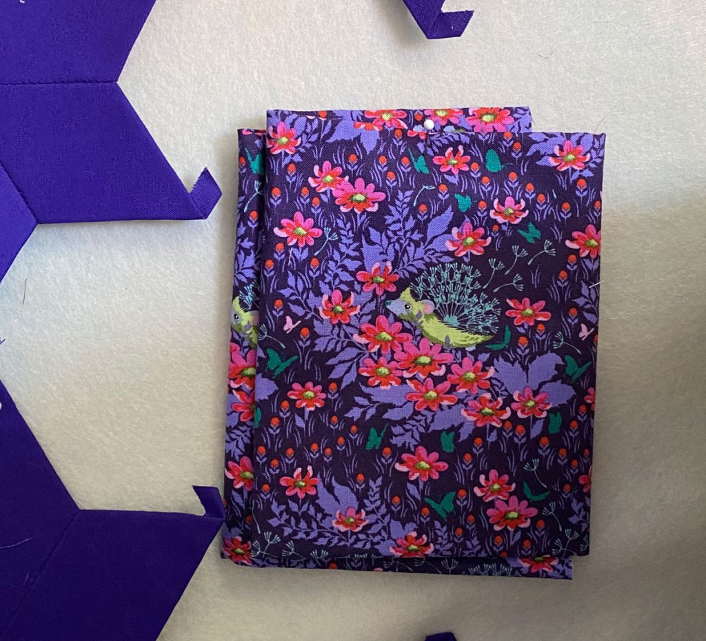
That little hedgehog should be the focus, centered along with some of the background leaves.
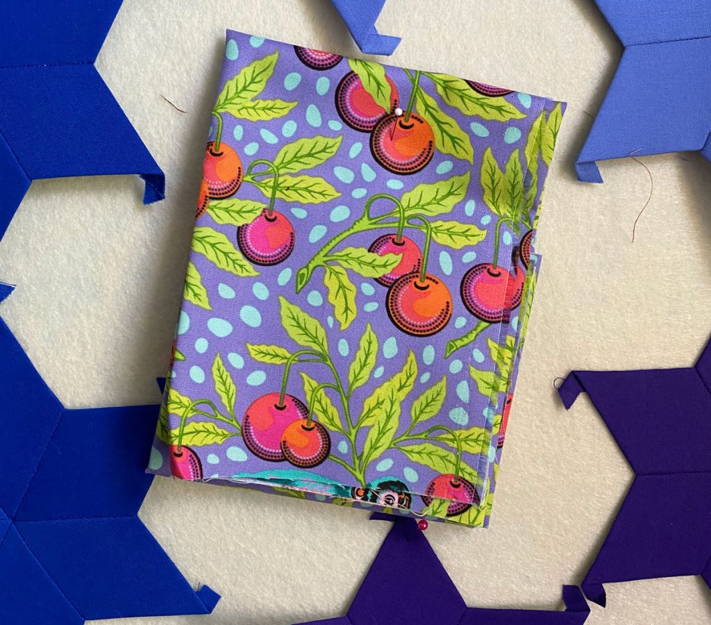
Instead of the little monkey (because I don’t have much of this print, and because I think he’s too big for the frame), I plan to get that background with some of the fruit.
Everything is subject to change, of course, if I happen to spy a newer print that I feel would look better in the space, or if I just can’t find a good focus area.
